DirectID Insights was launched earlier this year and we have been overwhelmed by the positive feedback. A crucial piece in the bank data puzzle was solved and our customers could finally see past what was simply thousands of lines of coded transactions on a screen, to truly see the value in the bank data.
So now that we've unlocked this value for our customers, where to next?
Well we don't simply stop at V.1 here, we've been constantly working on smaller updates to ensure you get the best experience from Insights. The changes have been focused on ensuring you can see the value of your customer bank data quicker and easier, so you can make decisions faster and provide better services.
So what have we upgraded?
1. Account summary report
The account summary report is the most important report of Insights. It gives you a complete overview of an applicant at a glance. So it stands to reason this needs to include ALL of the information you need to make a decision on.
Well this is what did. After working with customers and industry experts, we upgraded the summary page to include 9 high level metrics that give you a better customer overview.
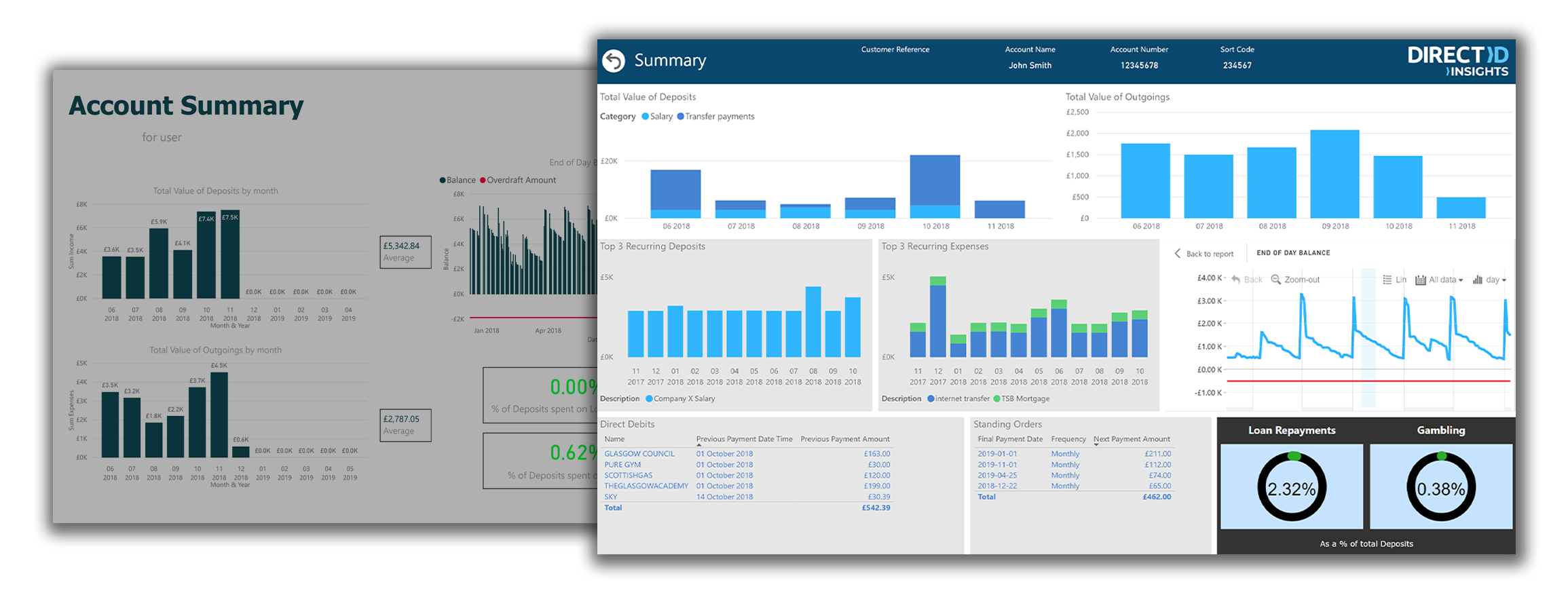
Allowing quicker decisions is the goal, and now you only need to go to our other reports if you want to look further into a customer's details, or think there is something out of the norm on the summary report.
2. Customer/applicant selection tools
Selecting customers by one reference number can be a challenge for different members of different teams. So we upgraded the customer selection tools to allow your to select by any of:
- A unique generated User ID
- Your own Customer Reference (eg. email or username)
- Customer Account Number
And to make this even more powerful you can select multiple accounts at once. This ensures you can analyse multiple accounts for a single applicant both combined, and individually, giving you the control on what information you will make your decisions on.
3. Report load times
Processing so much data visually can take a lot of computer power, but we don't want this to slow you down. So our team worked tirelessly on every report to ensure we optimised, upgraded, and rebuilt our visual assets and data analysis tools.
This all means you can now view your customers information in 1/3 of the time you previously could. And with this reduction, and our initial data gathering, transaction categorisation, and trend analysis time reaching as low as 2 minutes, our customers can now receive an application and make a decision on it in minutes! Not hours, not days. Now that's a competitive edge.
4. Filters and drop downs
Sometimes you need to look deeper into an applicants financial transactions. You might need to now what happened in a specific month, or quarter. Or you might need to now how these records compare to previous months information.
We've optimised our filters and drop downs to provide you these key options, and removed all the clutter and hard to use time scale filters. Now get the information you need simply and quickly.
The best is yet to come though, read on to see how we made looking into specific dates, or categories of spending even easier with our graphs update below...
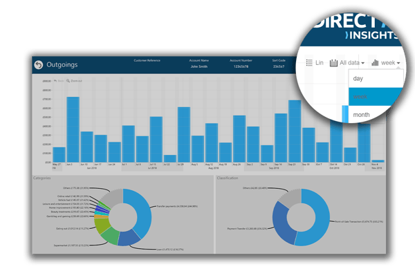
5. Charts and filtering UX
Want to see just the 'Eating Out' payments for the year? How about only Point-of-sale transactions month on month? This just got so much easier, and so much more powerful.
You can now navigate to any chart, and simply select the portion you want more information on. Not only will this highlight the section of the particular chart you are looking at, but it will filter all other charts on the same page to what you have selected.
This allows you to quickly see specific details on spending habits for different categories of spend, classifications of how they spend, you can even select a specific months on the graph and instantly change the report to daily trends for that month.
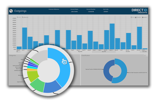 Other features allow you to filter by multiple categories by simply hold Ctrl and selecting another category, or zooming into categories and months by selecting different segments on different charts. The easiest way to learn how powerful this is though us to give it a go yourself.
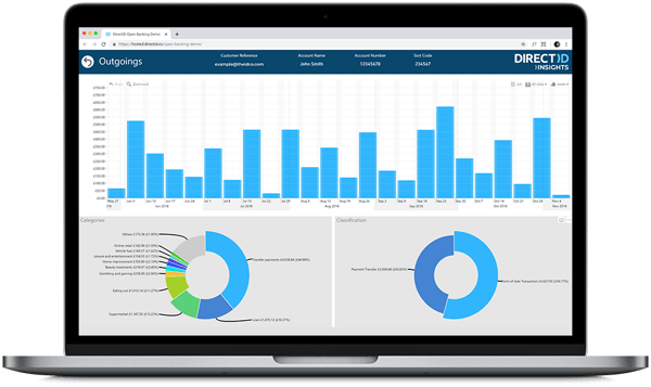
6. Data visibility and readability
To top all of this off the UI of DirectID Insights reports received a massive amount of design love. This included updated header styling, new colour ranges for our charts, different background contrasts, and data label updates.
The result of these updates mean you can view, filter, and manage applicants easier and quicker than before. The design is now more readable, you won't get lost on which applicant you are viewing, and the data presented can be consumed far more efficiently by those assessing applicants.
We hope all of these upgrades provide you, our customers, with the tools you need to make faster decisions and build better solutions.
But we are always looking to be better! If you have any feedback about what you would like to see next from our updates please feel free to contact us at support@directid.co.
Want to know more about how DirectID Insights could benefit your business?
Click below to Book a Demo, or talk to a specialist about bank data. Our team of experts are more than happy to work through how Insights could fit into your existing processes, get your business started with bank data, and help you understand the value it could provide to your business model.